- [ifp_html_css] Gredient2022년 06월 04일
- 홍유진
- 작성자
- 2022.06.04.:58
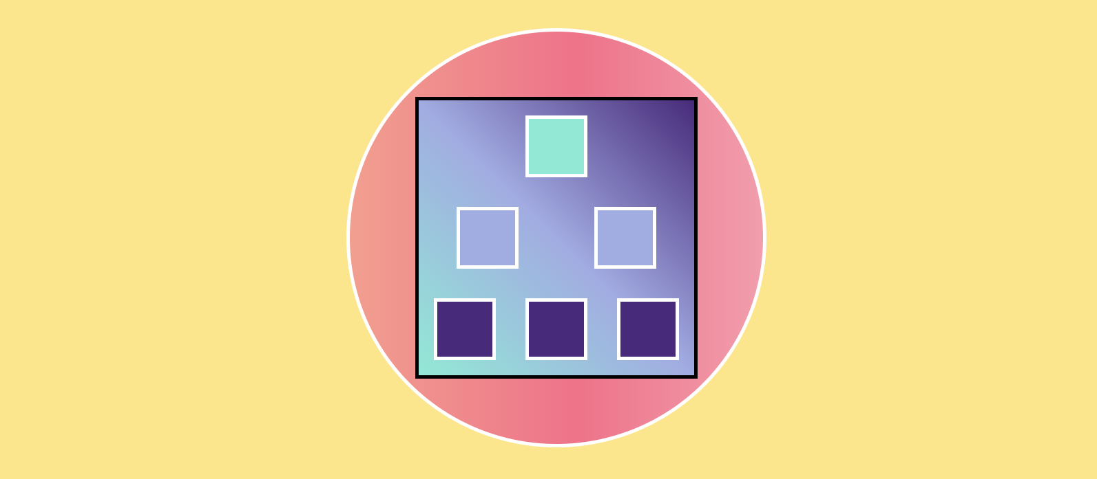
[실행화면]
[html 소스]
<!DOCTYPE html>
<html lang="en">
<head>
  <meta charset="UTF-8">
  <meta http-equiv="X-UA-Compatible" content="IE=edge">
  <meta name="viewport" content="width=device-width, initial-scale=1.0">
  <title>Gredient</title>
  <link rel="stylesheet" href="style_gredient.css">
</head>
<body>
  <div class="wrapper">
    <div class="big">
      <div class="small first"></div>
      <div class="second">
        <div class="small"></div>
        <div class="small"></div>
      </div>
      <div class="third">
        <div class="small"></div>
        <div class="small"></div>
        <div class="small"></div>
      </div>
    </div>
  </div>
</body>
</html>
[CSS 소스]
body {
  background-color: #ffe57f;
}
.wrapper {
  width: 600px;
  height: 600px;
  background-color: #ff9a8b;
  margin: 50px auto;
  border: 5px white solid;
  border-radius: 50%;
  display: flex;
  align-items: center;
  background-image: linear-gradient(  90deg,
  #ff9a8b 0%,
  #ff6a88 55%,
  #ff99ac 100%);
}
.big {
  width: 400px;
  height: 400px;
  background-color: #74ebd5;
  margin: 50px auto;
  border: 5px black solid;
  background-image: linear-gradient(
    45deg,
    #74ebd5 0%,
    #9face6 50%,
    #4c297f 100%
  );

  display: flex;
  flex-direction: column;
  justify-content: space-around;
}
.first,
.second,
.third {
  display: flex;
  justify-content: space-around;
}
.small {
  width: 80px;
  height: 80px;
  border: 5px white solid;
  margin: 20px auto;
}
.first {
  background-color: #74ebd5;
}
.second div {
  background-color: #9face6;
}
.third div {
  background-color: #4c297f;
}
flex
위의 예시에서 부모 요소인 div.big, 자식 요소 div.first, second, third 가 있을 때 "big은 Flex의 영향을 받는 전체 공간이고, 설정된 속성에 따라 각각의 아이템이 어떤 형태로 배치되는 것" 이라고 생각하면 된다.
flex big 적용하는 속성
1. display: flex;
flex 자식 요소들은 가로 방향으로 배치되고, 자신의 width 만큼만 차지한다. height는 big 의 높이만큼 늘어난다.
2. 배치 방향 설정 - flex-direction
자식 요소들이 배치되는 축의 방향을 결정하는 속성이다. 즉 메인축의 방향을 가로 or 세로 할건지 정해준다.
.big {
	flex-direction: row;           /* 행(가로) 방향으로 배치 */
    flex-direction: column;        /* 열(세로) 방향으로 배치 */
	flex-direction: row-reverse;   /* 역순으로 가로 배치 */
	flex-direction: column-reverse;/* 역순으로 세로 배치*/
}
2. 메인축 방향 설정 - justify-content
메인축 방향으로 자식 요소들을 정렬하는 속성이다.
.big {
	justify-content: flex-start;    /* 시작점으로 정렬 (row-왼쪽, column-세로) */
	justify-content: flex-end;      /* 끝점으로 정렬 (row-왼쪽, column-세로) */
	justify-content: center;        /* 가운데 정렬 */
	justify-content: space-between; /* 사이에 균일한 간격을 만든다 */
	justify-content: space-around;  /* 둘레에 균일한 간격을 만든다 */
	justify-content: space-evenly;  /* 사이와 양 끝에 균일한 간격 */
}
3. 수직축 방향 설정 - algin-items
수직축 방향으로 아이템들을 정렬하는 속성
.container { align-items: stretch; /* 아이템들이 수직축 방향으로 끝까지 쭈욱 늘어난다 */ align-items: flex-start; /* 아이템들을 시작점으로 정렬 (row-위, column-세로) */ align-items: flex-end; /* 아이템들을 끝으로 정렬 (row-아래, column-오른쪽)*/ align-items: center; /* 가운데로 정렬 */ align-items: baseline; /* 텍스트 베이스라인 기준으로 정렬 */ }'Web Frontend > HTML_CSS' 카테고리의 다른 글
[ifp_html_css] color (0) 2022.06.04 [ifp_html_css] CSS diner 21 ~ 32 (0) 2022.06.03 [ifp_html_css] CSS diner 11 ~ 20 (0) 2022.06.03 [ifp_html_css] CSS diner 01 ~ 10 (0) 2022.06.03 [ifp_css_html] 나누기 (0) 2022.06.03 다음글이전글이전 글이 없습니다.댓글
스킨 업데이트 안내
현재 이용하고 계신 스킨의 버전보다 더 높은 최신 버전이 감지 되었습니다. 최신버전 스킨 파일을 다운로드 받을 수 있는 페이지로 이동하시겠습니까?
("아니오" 를 선택할 시 30일 동안 최신 버전이 감지되어도 모달 창이 표시되지 않습니다.)